The Problem
Access to capital was a recurring constraint on Modena's growth. Early-stage funding from the parent company and later bond issuance kept the business operating, but both had clear limits. Using established P2P marketplaces would have significantly reduced margins and control.
The platform had to convince external investors to fund a single-originator loan portfolio — something that typically relies on scale and diversification to feel trustworthy. We needed to launch quickly, with limited room for experimentation, and get the fundamentals right from day one.
My Role
Stakeholder Management
Reported directly to the CEO (who doubled as PM). Final product decisions were theirs — my role was to shape how business and legal constraints translated into investor-facing experiences, advocating for clarity and usability within those boundaries.
I owned competitive analysis, interaction design, the full design-to-handoff process, and built a Storybook component library post-launch to formalize the design system.
Research & Discovery
I worked through requirements with the PM and Systems Architect to define scope. Germany was chosen as the launch market — the largest in the EU and one where we had legal clearance to operate. For the MVP, we validated the concept within our existing investor circle rather than running broader surveys, focusing on matching competitor offerings rather than expanding the product scope.
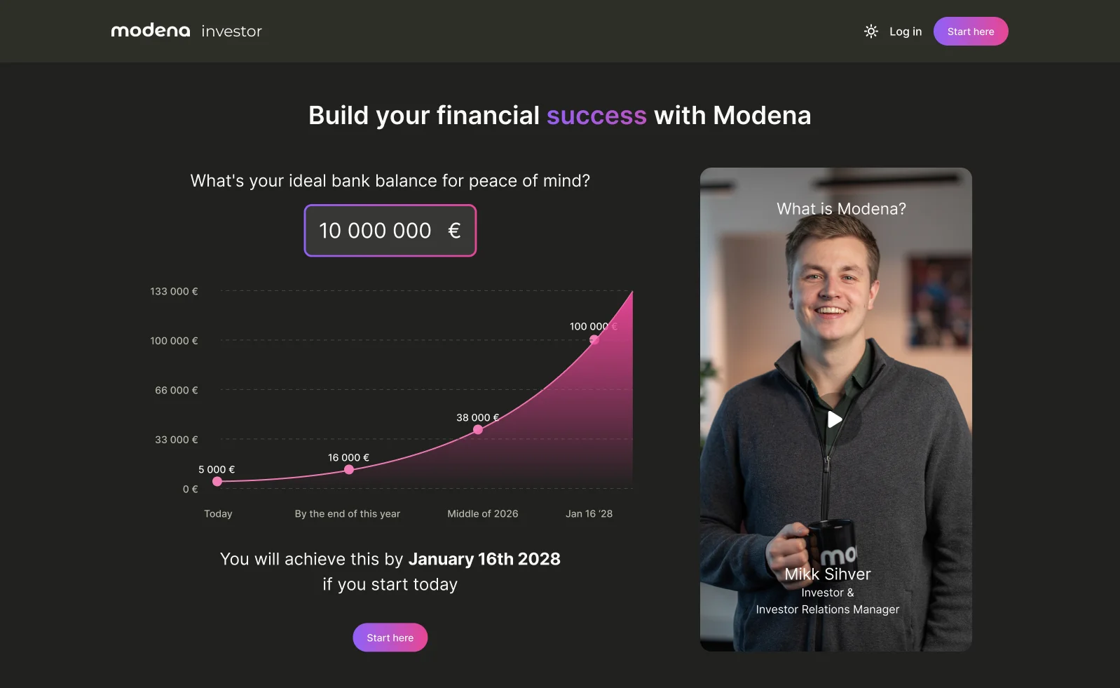
I analyzed Mintos, PeerBerry, Bondora, Monefit, and Hive5 — focusing not on visual design but on behavioral patterns: how quickly investors understand where their money goes, how easily they assess liquidity, and how clearly risks are framed.
Post-launch, an independent German P2P blog review validated that automated Vaults were easy to understand and that monthly payouts stood out as a differentiator. It also surfaced skepticism around buyback mechanisms and performance transparency — reinforcing our focus on clarity over feature depth.
Exploration
Strategic Design Decision
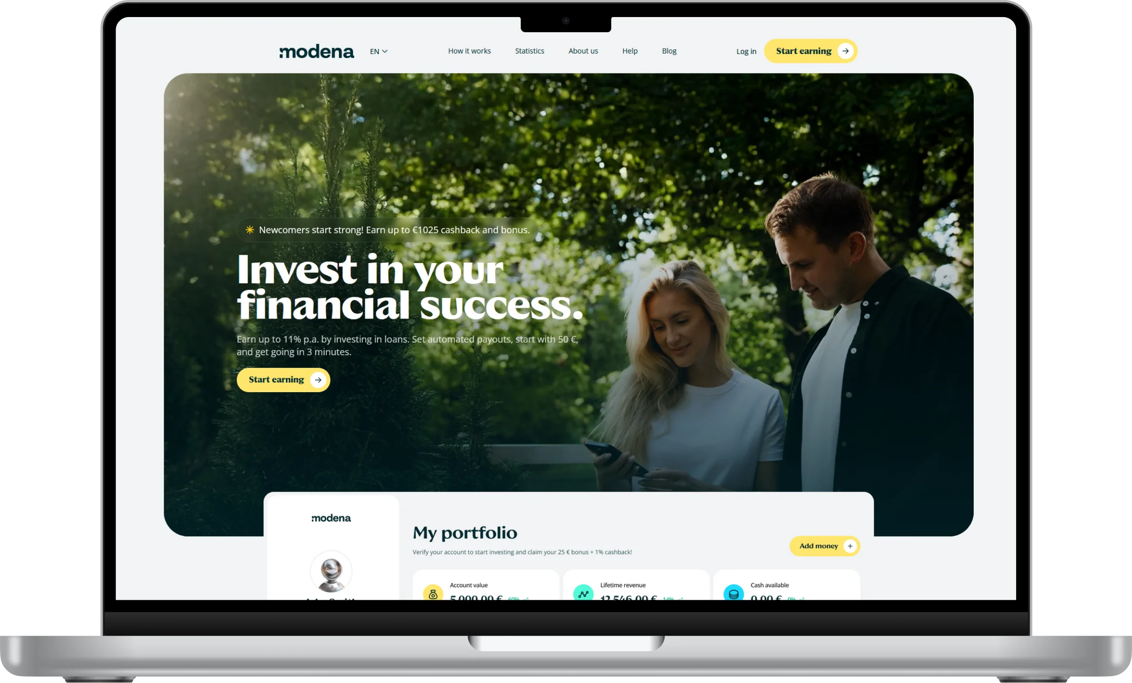
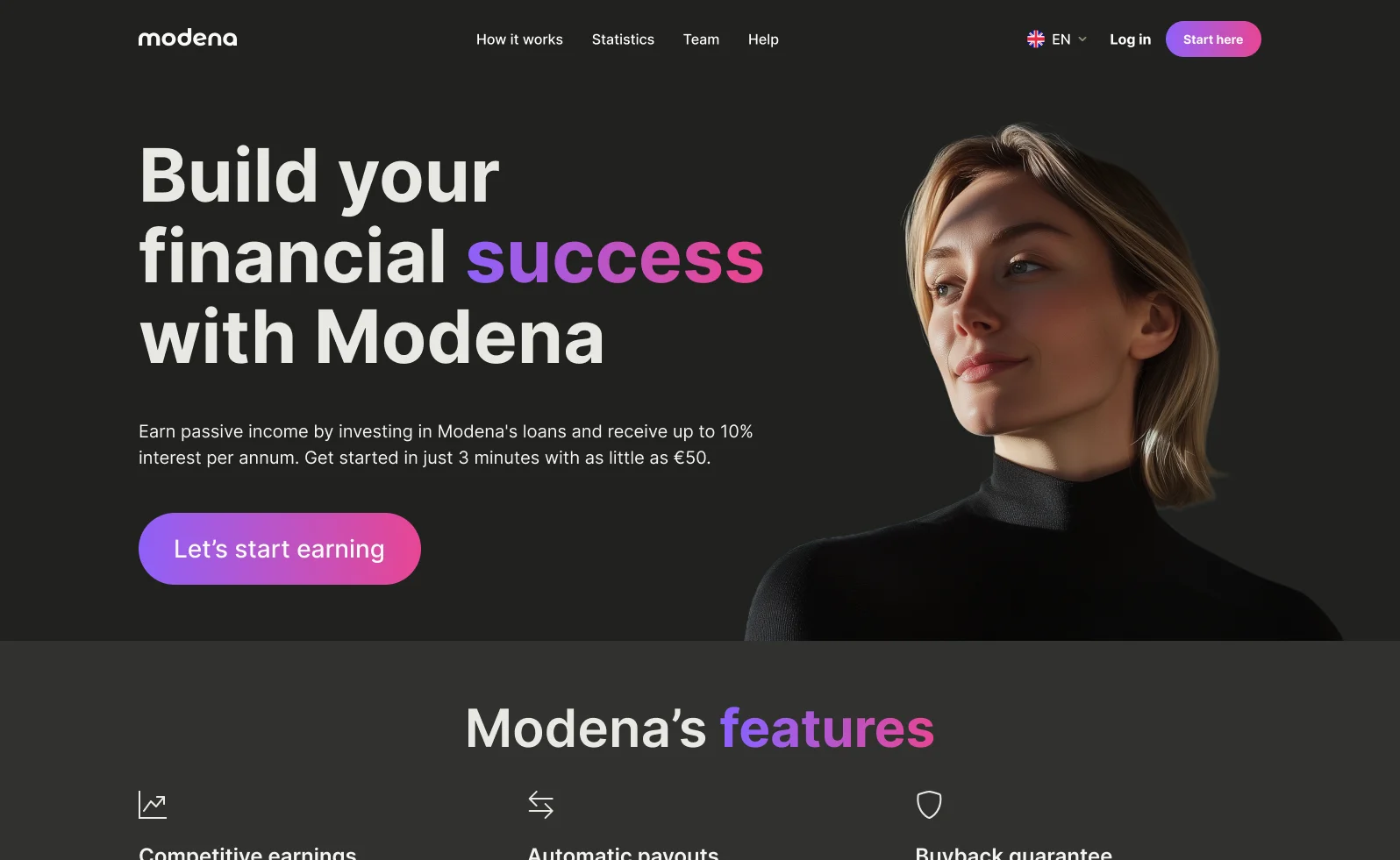
Chose familiarity over innovation. The early MVP prototype leaned into a modern, tech-forward aesthetic that helped position the platform as "new" — but it didn't match the expectations of a wider investor audience. Investors needed to rely on prior mental models when evaluating a single-originator platform. Novelty increased perceived risk, not reduced it. We pivoted to a conservative visual language aligned with established P2P investment patterns.
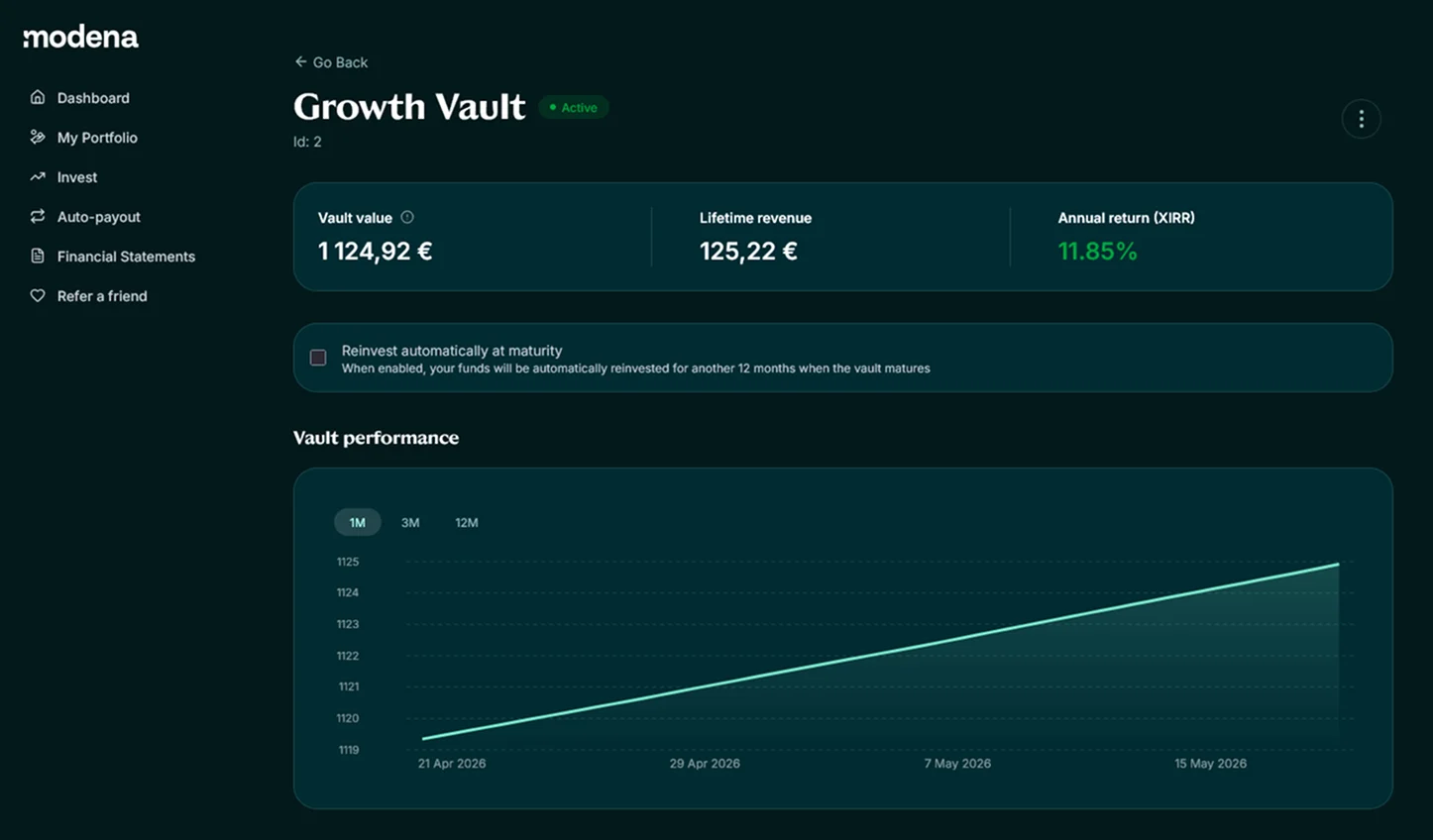
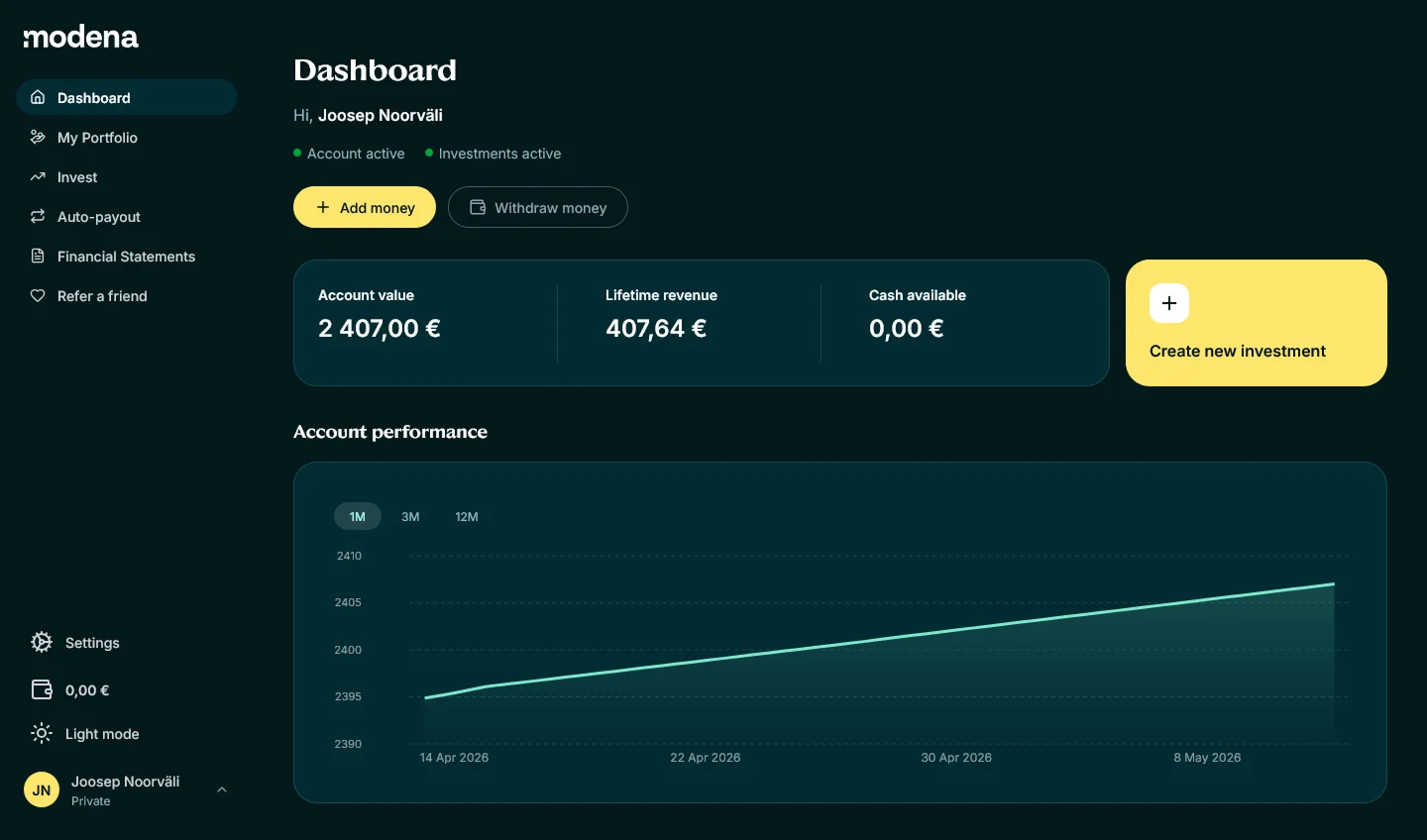
The main user journey was mapped to identify weak points for post-launch re-evaluation. Information architecture was shaped by familiarity — the dashboard surfaced what investors expected from competitor platforms, vault detail pages had two layers (core values up front, in-depth matched loans to satisfy legal requirements), and account settings were kept minimal for MVP. Investments had to map precisely to underlying contracts, so any ambiguity carried regulatory and trust risks.
Solution
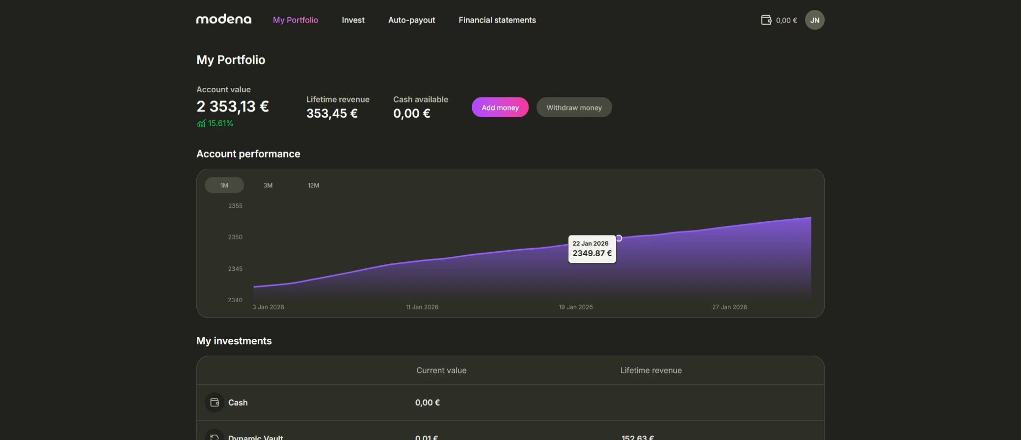
The platform was structured around pooled investment products called Vaults. These abstracted loan-level complexity while still reflecting the legal reality of the underlying contracts. The MVP was built in 2 months.
Three core products were introduced early:
Dynamic Vault
Designed for flexibility with short lock-in periods
Growth Vault
Focused on long-term returns
Secure+ Vault
Emphasizing capital preservation and lower risk
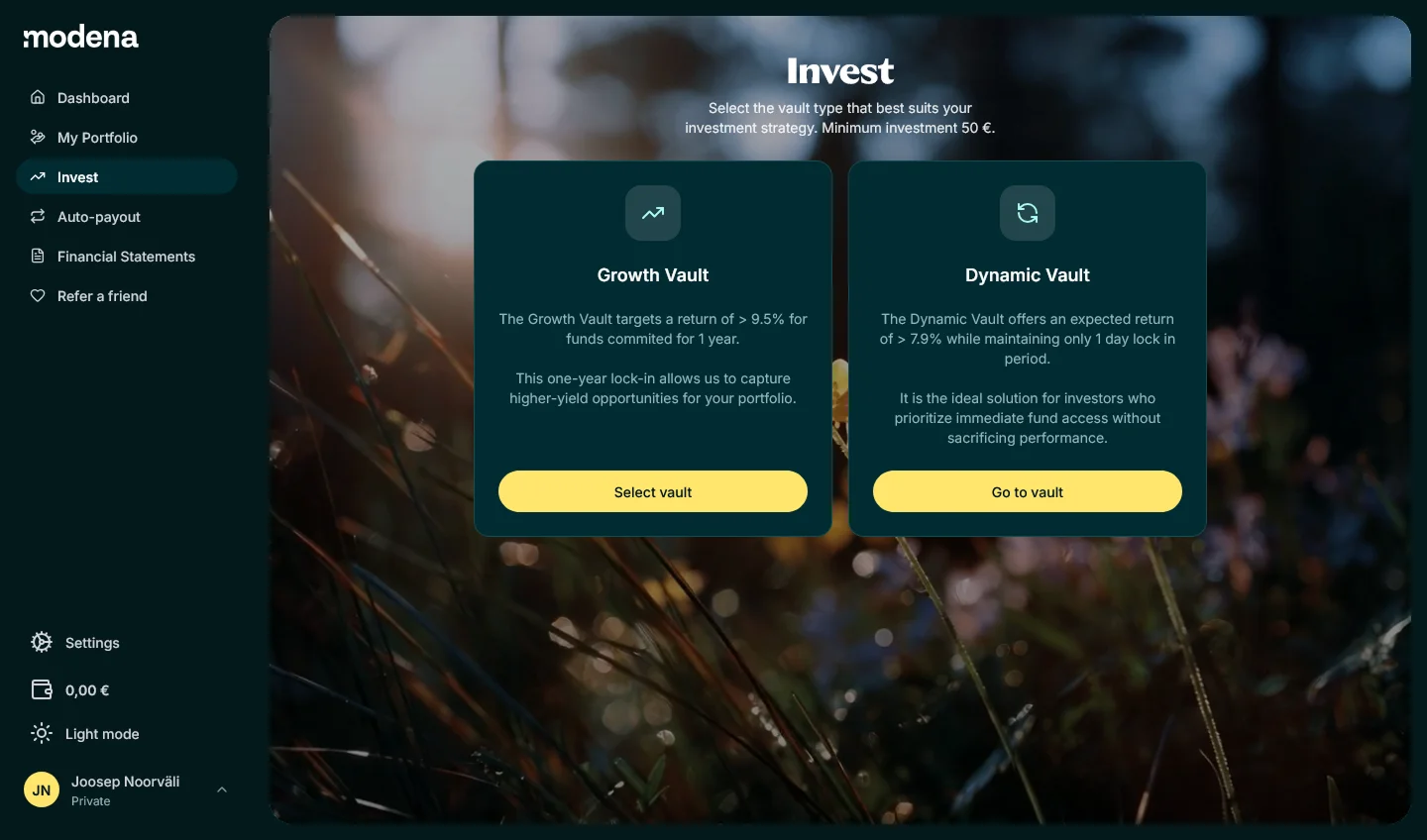
Across all products, the interface emphasized progressive disclosure, distinct visual language, and clear separation between expected returns and guarantees.
Onboarding
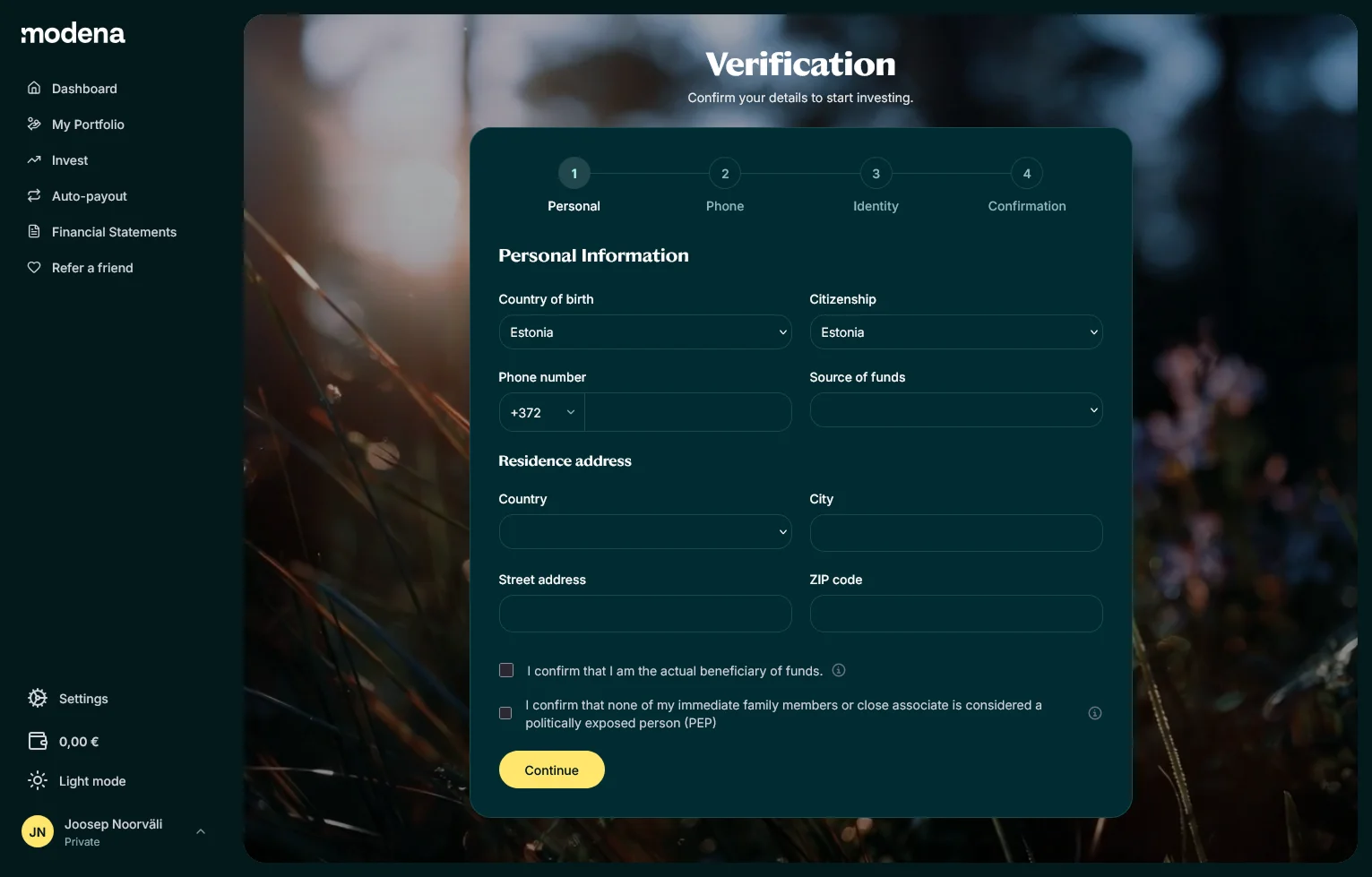
The investment and onboarding flow was the most heavily iterated part of the product. Steps were removed and modified aggressively to reduce friction — registration was designed to take less than a minute, with KYC verification completing in a few minutes through Veriff integration.
Returns display was iterated to feel more impactful — moving from buried text to prominent, scannable formats that gave investors immediate confidence in their portfolio performance.
Testing & Trust
Before launch, early investors and inner circle participants ran through the platform to ensure nothing was missed and everything was understandable at a base level. This wasn't formal usability testing — it was practical validation for an MVP where getting the fundamentals right mattered more than perfection.
Trust as a Design Problem
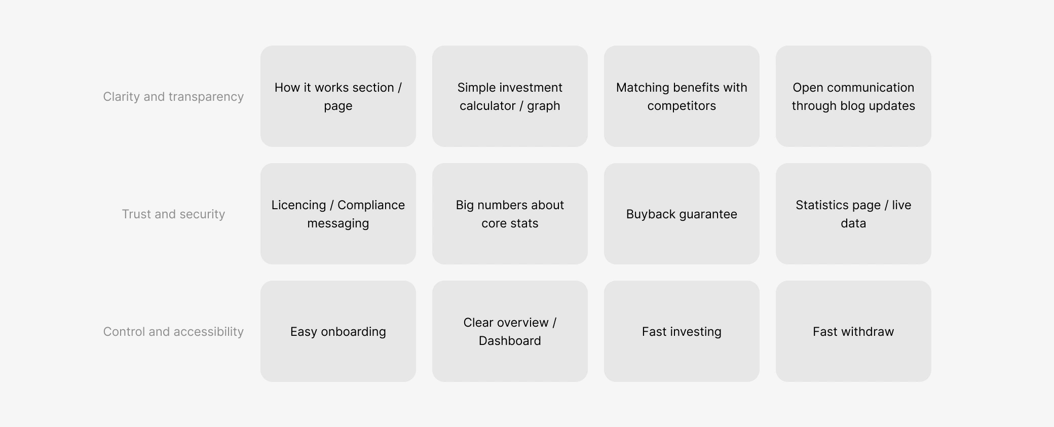
The biggest friction point was trust in a new platform. Investors needed reassurance that their money was safe with an unfamiliar product. I addressed this by making risk acknowledgment explicit, adding Financial Supervision Authority licence notices, and integrating recognized third-party providers like Veriff for identity verification.
Withdrawal was another pain point — initially very limited due to how the pooled product worked. We designed an accelerated withdrawal option with clear limitations, giving investors more liquidity without compromising the fund's financial stability. This directly addressed one of the most common concerns raised in feedback.
Results
Post-Launch Ownership
After a closed launch with existing bond investors, early feedback revealed confusion around lock-in periods and buyback credibility. I drove iterations to simplify rules, clarify buyback behavior, and improve how returns were communicated — changes that directly increased investor confidence.
Within one year, the platform became a central funding channel for Modena, covering €4M of the loan portfolio and enabling the launch of business loan and credit products previously constrained by capital availability. At peak momentum, a new investment was made every 79 minutes. Growth was supported by a targeted German finance influencer via the Clickwise platform — more effective than broad marketing for a trust-driven financial product.
Design Impact
Specific design decisions tied directly to measurable outcomes:
Trust signals and explicit risk acknowledgment — adding Financial Supervision Authority licence notices and clear risk framing directly contributed to the 76% retention rate and growing user base.
Onboarding optimization — streamlined registration and KYC flows with adjusted copy minimized misunderstanding and drop-off, achieving sub-minute registration.
Investor feedback loops — surveys received nearly 50 replies that directly influenced the product roadmap, including adding 2FA and improved financial statements.
Learnings
In fintech, familiarity builds more trust than innovation. Predictable behavior and clear liquidity rules mattered more than feature richness. Legal and financial constraints don't just limit design — they are the design material. And even informal investor feedback can quickly surface trust gaps that analytics alone would miss.